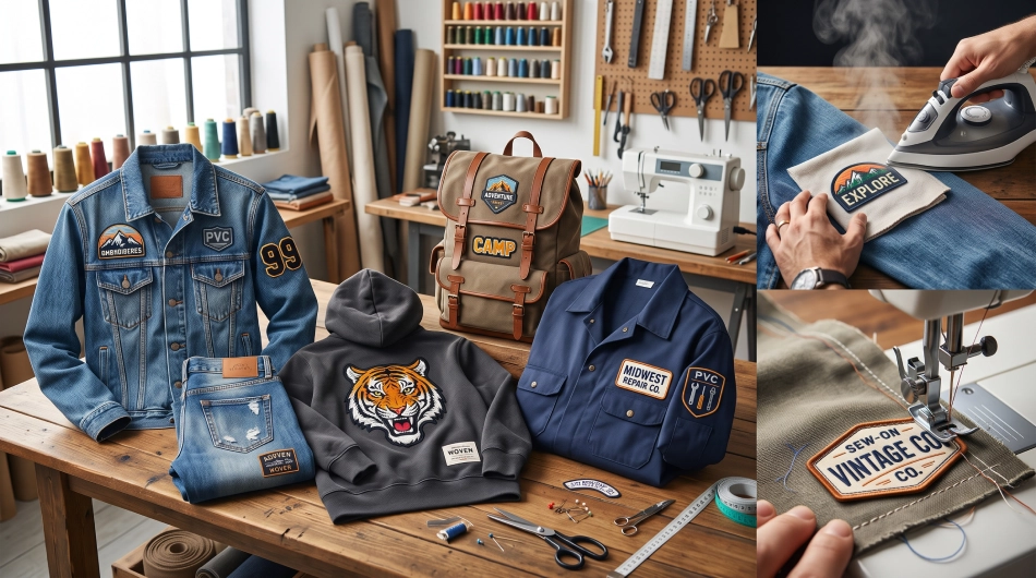
A custom patch may be small, but it can carry a lot of identity. For a brand, it can turn a logo or message into something people can wear. For a sports team, school club, or organization, it can create a recognizable symbol that connects members. The right patch can also make jackets, uniforms, hats, and bags feel less generic.
Creating one, however, involves more than placing a logo onto fabric. The shape, colors, lettering, material, size, and purpose all affect how the finished patch looks. A design that works well on a screen may need to be simplified or adjusted before it works equally well in thread.
The following considerations can help turn an initial idea into a patch that represents your brand or team clearly and effectively.
- Start With a Clear Purpose
Before thinking about colors or shapes, it helps to establish what the patch needs to communicate. A business logo patch has a different purpose from a team achievement patch or a school letter.
Chenille letters, for example, bring bold lettering to life with their soft, raised texture and are a natural fit for varsity, school, and team designs. Their distinctive look can help initials, names, and other lettering become a recognizable part of the overall design.
It is also worth deciding whether the patch will identify a group, recognize an accomplishment, represent a brand, or simply add a decorative element. A clear purpose makes later design choices easier and keeps the final design focused.
- Keep the Design Connected to the Group
A successful patch should feel like it belongs to the brand or team it represents. Existing logos, mascots, colors, initials, and visual themes provide a natural starting point.
For sports organizations, letterman sports patches can represent a particular sport, team, season, position, or achievement while remaining connected to the wider identity of the school or club. A business might instead adapt an existing logo or recognizable brand symbol.
Consistency matters because the patch may appear alongside uniforms, jackets, merchandise, or other branded materials. It does not have to reproduce every existing design element, but someone familiar with the organization should be able to recognize the connection.
- Simplify the Main Idea
Small designs have limited room for detail. Trying to include a logo, slogan, date, mascot, name, and several decorative elements can quickly make a patch difficult to understand.
A stronger approach is to identify one main feature. That might be an initial, logo, mascot, team name, or symbol. Secondary details can then support it without competing for attention.
Simplification becomes particularly important when converting detailed digital artwork into stitching. Thin lines and tiny text that look sharp on a screen may not translate clearly onto fabric.
A patch does not need to contain every part of a brand identity. It only needs enough information to be recognizable and meaningful.
- Choose a Shape That Supports the Design
The outline of a patch contributes to its appearance before anyone notices the smaller details.
Circles and ovals work well for balanced logos and emblems, while rectangles provide more room for names and phrases. Shields can create a traditional team or club appearance, and custom-cut shapes can follow the outline of a mascot, letter, or logo.
The shape should support the artwork rather than force it into an unsuitable space. A wide team name may feel cramped inside a narrow circle, while a compact symbol could become lost inside a long rectangular patch.
A clear border can also help define the shape and separate the design from the garment underneath.
- Use Colors That Represent Your Identity
Color is one of the quickest ways to connect a patch with an established brand, school, or team.
Using existing brand or team colors helps maintain recognition across different materials. However, reproducing every shade from a detailed logo is not always necessary. A smaller palette can often make a patch cleaner and easier to read.
Contrast is equally important. Lettering and symbols need enough separation from the background to remain visible. Similar shades can work for a subtle design, but important details should not disappear into one another.
The garment color should also be considered. A patch that looks clear on a white background may create a very different effect on a dark jacket.
- Make Lettering Easy to Read
Names, initials, dates, and short phrases often play an important role in custom patches, so typography deserves careful attention.
Bold, clean lettering generally remains clearer when stitched, particularly at smaller sizes. Decorative scripts can work when the text is short and large enough to preserve the shape of each character.
Spacing matters too. Letters positioned too closely may merge visually, while excessive spacing can make a word feel disconnected.
The style of the lettering should also match the identity behind the patch. Athletic block fonts can reinforce a traditional team aesthetic, while cleaner typefaces may better suit a modern business or organization.
- Consider Where the Patch Will Be Worn
A design should be created with its final location in mind.
A large back patch has enough space for bolder artwork and additional details. Chest and sleeve patches usually need to communicate their message within a smaller area. Hats and bags introduce different proportions again.
Placement affects shape as well as size. A wide design may work across the back of a jacket but feel awkward on a sleeve. A compact emblem can fit comfortably in several locations.
Thinking about the garment early helps prevent a design from being created at one scale and then losing clarity when it has to be reduced.
- Give Personalization a Role
Teams and organizations often need a shared identity, but that does not mean every patch must be identical.
A common logo can be paired with individual names, numbers, roles, graduation years, or positions. This keeps the overall appearance consistent while recognizing the person wearing it.
Personalized elements can also add meaning to achievement patches. A date, season, or championship year can connect the design to a particular moment without changing its central identity.
The key is to make personalization part of the design rather than adding information simply because space is available.
- Review the Design as a Patch, Not Just an Image
Before finalizing the artwork, it helps to view it at approximately the size it will actually be produced. Details that appear perfectly clear when enlarged may become difficult to recognize at three or four inches.
Check whether the main symbol is immediately visible, the text remains readable, and the colors have enough contrast. Removing one unnecessary detail can sometimes improve the result more than adding another.
The goal is not to reproduce digital artwork perfectly. It is to create a design that works effectively in its physical form.
Create Something People Can Recognize
The perfect custom patch does not need to be complicated. Its strength comes from representing a brand or team clearly while working within the practical limits of its size and material.
Purpose, recognizable imagery, readable lettering, thoughtful colors, and suitable proportions all contribute to the final result. When those elements work together, a patch becomes more than decoration. It becomes a compact representation of the group behind it—one that can be recognized and worn with meaning.